Winner of the 2024 Datathon AED Challenge
Datamatch was born during Datathon FME and was developed in just two days by an amazing team of three. As the frontend developer and UI/UX designer for this project, I'll focus on the design decisions and user experience challenges we tackled to make hackathon team formation effortless.
For technical details about our matching algorithm and backend architecture, check out our Github repository.
Design Philosophy
Our primary goal was to create a seamless extension of the existing Datathon.cat ecosystem. Since Datamatch was designed specifically to enhance registration for this hackathon, maintaining visual consistency was crucial.
We drew inspiration from the original Datathon.cat color palette, embracing a modern blue-toned aesthetic that felt familiar. Our design philosophy centered on three key principles:
- Consistency: Maintaining brand coherence with the existing platform
- Simplicity: Reducing stress through intuitive interfaces
- Efficiency: Streamlining the team formation process
User Experience Design
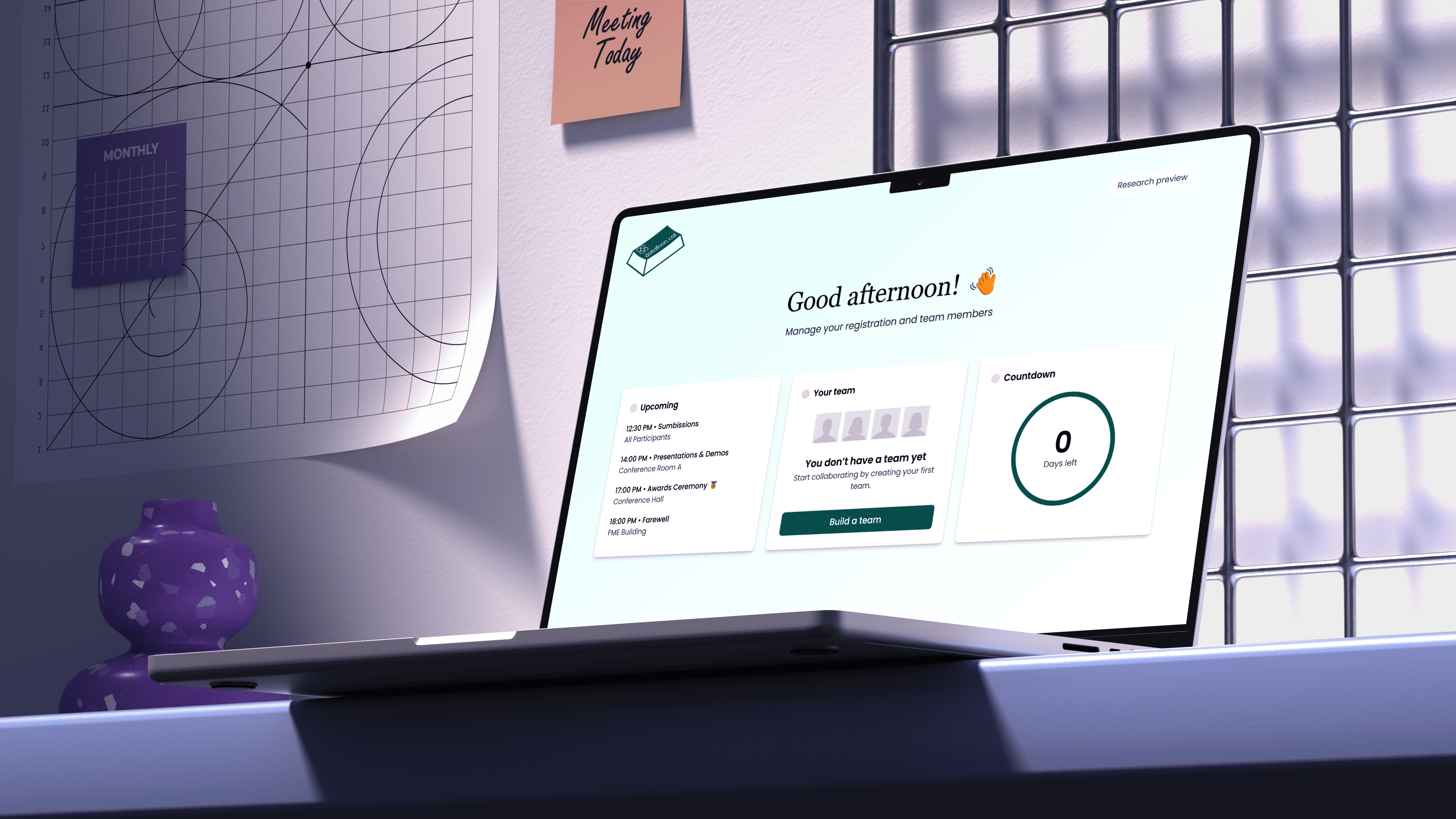
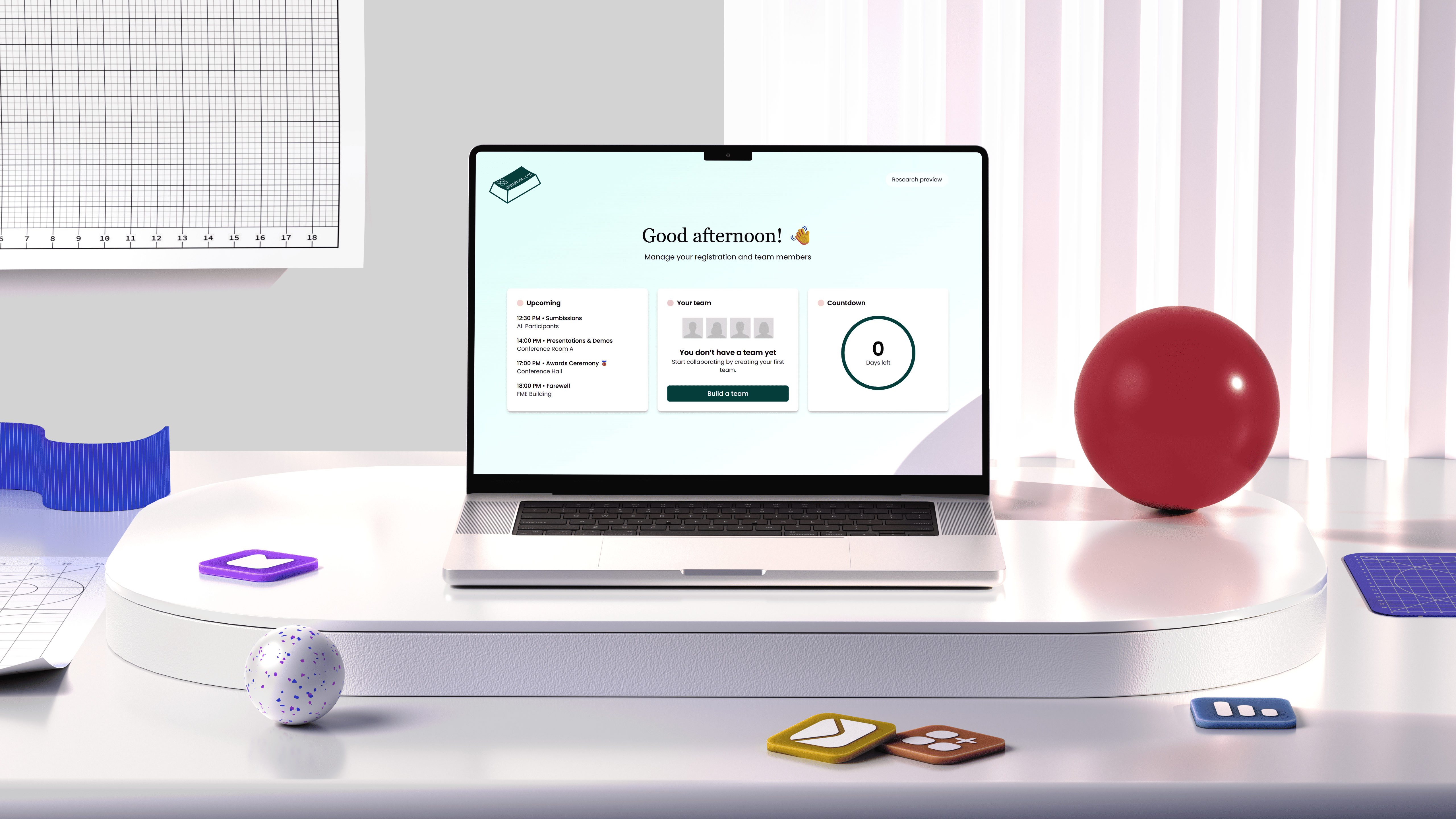
The Dashboard
We designed the participant dashboard as a centralized hub, providing users with immediate access to essential information like upcoming events and deadlines. This approach ensures that participants never miss critical details and can quickly orient themselves within the platform.
Reimagining Registration Forms
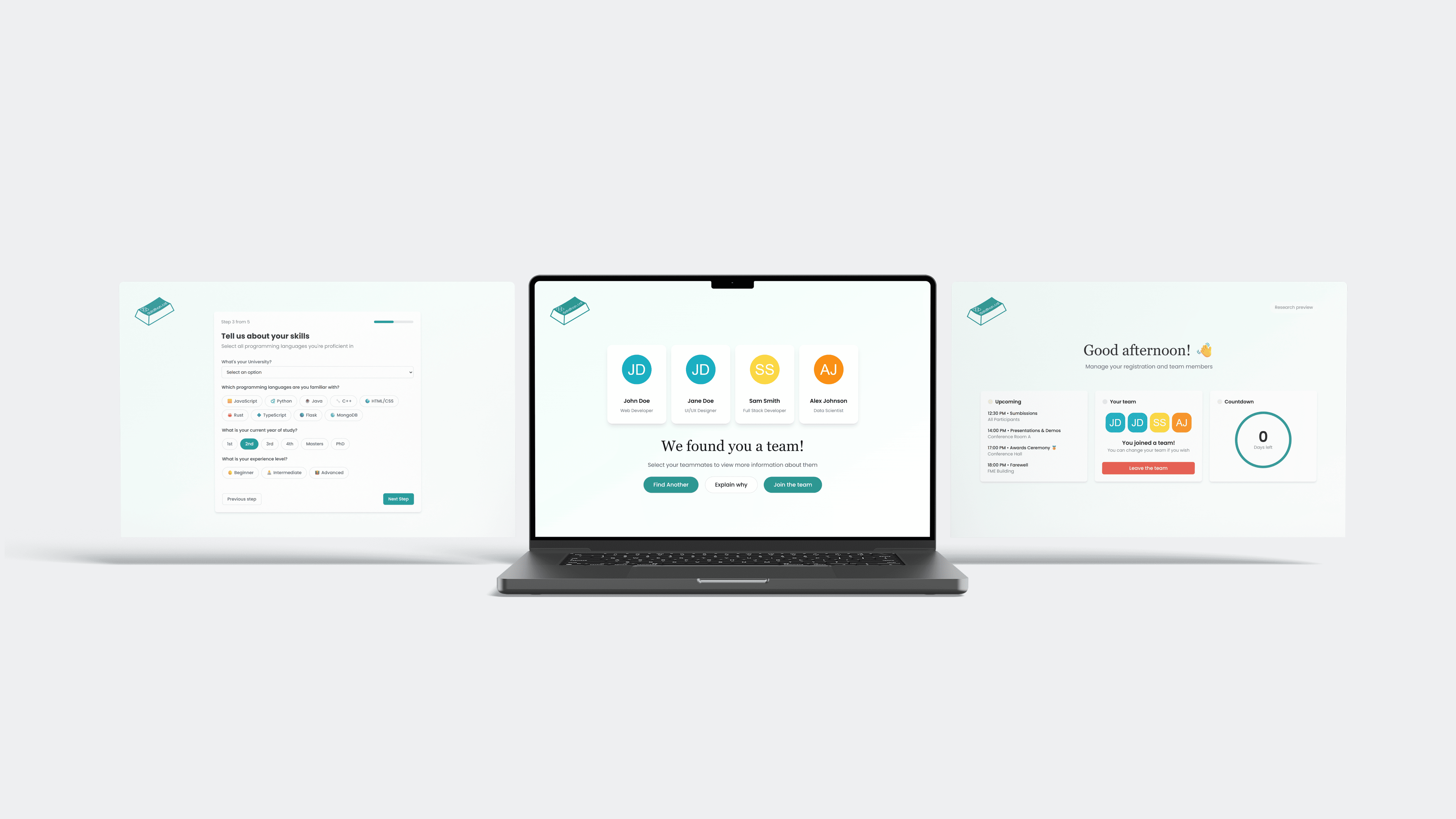
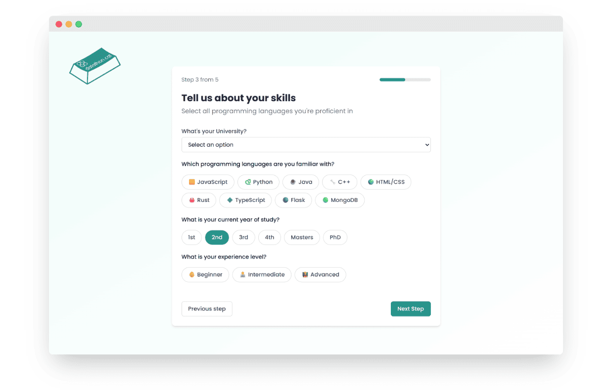
Traditional one-page registration forms can be overwhelming, especially when collecting the comprehensive data needed for effective team matching. Our solution was to break the registration into logical, digestible sections.
Instead of presenting users with a daunting wall of fields, we created a progressive disclosure system. Each section focuses on a specific aspect of the participant's profile (technical skills, interests, availability, etc.), making the process feel simple and easy.
Interactive Team Building
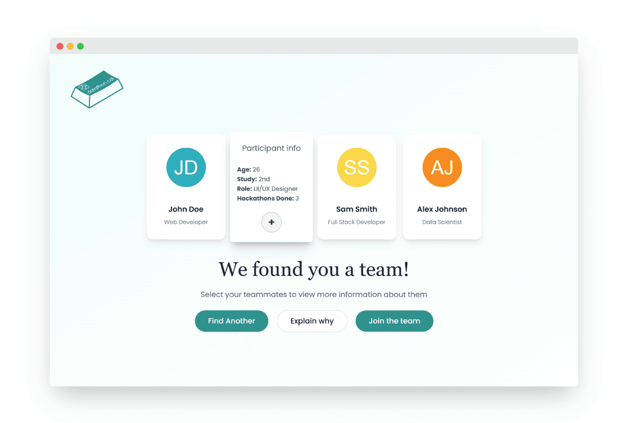
Rather than overwhelming users with endless lists of potential teammates, we took a curated approach. Our interface presents one optimal team combination at a time, reducing decision paralysis. Users can focus on evaluating a single, high-quality match rather than getting lost in endless possibilities.
Each participant is represented by an interactive, double-sided card that reveals key information about their skills and experience. This format allows users to quickly assess compatibility while maintaining a clean, uncluttered interface.
The team-building process itself is designed around flexibility. Users can:
- Save promising candidates to the team selection
- Swap team members to test different combinations
- Adjust their team composition until they find the perfect balance
Once users have assembled their ideal team, joining is as simple as a single click. The dashboard immediately reflects the new team composition, providing instant feedback and eliminating any uncertainty about the registration status.
Results and Impact
By focusing on user-centered design and reducing friction at every step, Datamatch transforms what was traditionally a stressful aspect of hackathon participation into an engaging, almost game-like experience. Team formation becomes less about lucky connections and more about strategic, data-driven matches that enhance the overall hackathon experience.
We were very happy to win the 2024 Datathon FME AED challenge.
Want to see it in detail? You can explore our codebase on Github